A CRM dashboard should answer the questions your team asks before the second cup of coffee: What needs attention today? Which deals are moving? Who is waiting on us? A useful crm dashboard turns scattered records into a short list of decisions. A bad one displays 47 colorful charts while a hot lead sits untouched in an inbox.
I have built enough sales systems to know the difference. Small teams do not need a mission-control wall covered in gauges. They need a reliable view that helps someone choose the next action in under a minute. If it takes longer to set up than to do the actual work, I’m out.
What a CRM dashboard should actually show
Start with the work, not the software. For most teams, a crm dashboard needs five basic answers: how many open opportunities exist, what stage each deal is in, which follow-ups are overdue, how much revenue is likely to close, and where ownership is unclear.
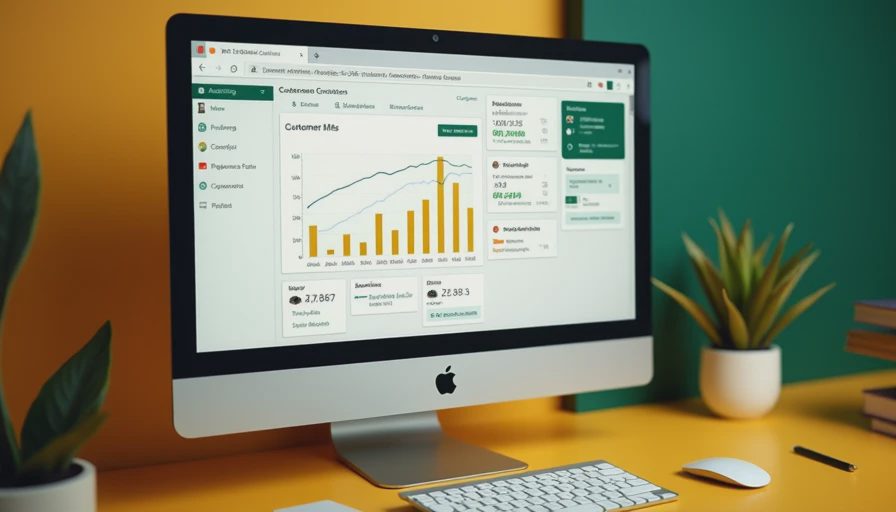
That does not mean five giant charts. A simple top row might show 38 open deals, 11 overdue tasks, $184,000 in weighted pipeline, and three opportunities without a next step. Under that, show a table of active deals with the owner, stage, estimated value, next action, and due date.
The table usually matters more than the chart. A pie graph can tell you that 30 percent of deals are in proposal. It cannot tell your salesperson to call the purchasing manager at 10 a.m. Tuesday. The dashboard should move work forward, not merely describe yesterday.
For a five-person sales team, this setup can fit on one screen. For a solo consultant, it might be a filtered list of prospects and follow-ups. The size changes. The principle does not: every number should connect to a decision or an action.
Choose metrics that change behavior
A crm dashboard becomes cluttered when every available field gets promoted to headline status. Total contacts, website visits, email opens, average deal age, conversion rate, and lifetime value can all be useful. They are not all useful this morning.
I separate metrics into three groups. The first group drives daily action: overdue follow-ups, new inquiries, deals with no next step, and tasks due today. The second group supports a weekly review: pipeline by stage, average time in stage, win rate, and forecast by owner. The third group is for occasional analysis, such as source performance or customer type.
This separation prevents a common mistake: building a dashboard for executives when the person using it is a busy account manager. If the team has to scroll past six reports to find today’s callbacks, adoption will fade fast.
Use plain labels. “Deals at risk” is better than “opportunities with declining engagement velocity.” Use dollars only when the amount has a clear definition. Decide whether pipeline means total potential revenue, weighted revenue, or contracted value, and write that definition beside the number. Confusion here can make a polished report actively dangerous.
Build the daily view around next actions
The strongest crm dashboard I have used was not the prettiest. It started with a queue titled “Do these next.” Each row showed the customer, last contact, next action, due date, and owner. A manager could spot missing dates without opening ten records.
Create a filter for overdue tasks, another for today’s tasks, and a third for new leads received in the last seven days. Add a view for deals that have had no activity for fourteen days. That last filter catches the quiet failures: opportunities nobody closed, reassigned, or intentionally paused.
Then establish one rule: every open opportunity must have a next action and a date. Not “follow up soon.” Write “send revised estimate Friday” or “call after budget meeting on May 12.” A specific task gives the next person something usable. It also makes handoffs less dependent on memory.
If your CRM supports automation, use it for reminders and routing, not for elaborate robot theater. A new web form can create a lead, assign an owner, and create a first-contact task. That is enough to save real time.

Connect the dashboard to a real workflow
A dashboard cannot repair a broken process by itself. If leads arrive through Gmail, LinkedIn, website forms, and referrals, decide where the official record lives. Otherwise, your crm dashboard will report only the work people remembered to enter.
For a small team, the workflow can be straightforward. A new inquiry becomes a contact and an opportunity. The owner qualifies it, records the problem and estimated value, schedules the next action, and moves the opportunity through agreed stages. When the deal closes, the handoff to onboarding includes the promised scope, timeline, and responsible person.
Tools such as HubSpot, Salesforce, Pipedrive, Zoho CRM, Airtable, and Notion can support pieces of this setup. The brand matters less than the discipline. A $20-a-month tool used daily beats a powerful platform that requires a weekly cleanup meeting to remain trustworthy.
Keep integrations limited at first. Connect the form, calendar, and email account only if those connections reduce duplicate entry. Zapier or Make can help pass information between systems, but every automation should have an owner and a failure check. Silent errors are how dashboards become fiction.
Common dashboard mistakes that waste time
The first mistake is tracking activity instead of progress. A rep can make 80 calls and still have no qualified opportunities. Activity counts are useful for coaching, but they should not be mistaken for revenue.
The second mistake is mixing definitions. If one person marks a deal as “won” when a proposal is accepted and another waits for payment, the win-rate report becomes an argument. Define each stage in ordinary language and add one example. “Proposal” might mean pricing was sent and the buyer confirmed a review date.
The third mistake is assigning everything to “unassigned.” That creates a report that looks full but gives nobody responsibility. If ownership is unclear, assign the record to a queue with a named person responsible for clearing it.
The fourth mistake is making the dashboard a surveillance device. Constantly measuring every email can make good people game the numbers. Focus on customer movement, clean handoffs, and timely follow-up. You are building an operating tool, not a digital ankle monitor.
A practical setup you can finish this week
On Monday, list the decisions the dashboard must support. Keep the list to five or fewer. On Tuesday, clean the fields that feed those decisions: owner, stage, amount, next action, next-action date, and last contact. Delete or hide fields nobody uses.
On Wednesday, build one daily view and one weekly view. Have a salesperson use the daily view during actual work, not during a presentation. Watch where they click, what they ignore, and which label makes them stop. Fix those problems before adding another chart.
On Thursday, test three records: a brand-new lead, a stalled opportunity, and a closed deal. Confirm that each appears where expected and that ownership, dates, and amounts remain accurate. On Friday, hold a 20-minute review. Ask which view saved clicks and which information was missing.
That process is deliberately boring. Boring is good. Repeat what works. Tweak one thing at a time. In a month, you should know whether the crm dashboard reduces follow-up gaps or merely gives everyone a new tab to ignore.
The payoff is fewer lost handoffs
The value of a crm dashboard is not the dashboard itself. It is the hour a salesperson no longer spends searching Slack for a promised quote, the manager no longer spends rebuilding pipeline in Excel, and the client who gets a timely answer because ownership was visible.
Start with one screen, five meaningful metrics, and a dependable next-action rule. Add complexity only after the basic view survives a tired employee on a Tuesday afternoon. That is the test I use for every system. If the team can open it, understand it, and act without a tour guide, you have built something worth keeping.




No feedback yet — submit the first.